

0-1 Product
iOS
Android
Web

Overview:
ABOUT:
what3words makes it easy to describe any precise location. Every 3 metre square in the world has a unique address made up of three random words, making it simple to find, share and navigate to any destination.
Company:
@what3words
Launched:
September 2025
Role:
Staff Product Designer
Team:
Iannish Possoa, Thi Khuc, Robyn Coles, Dave Duprey, Emanuel Amiguinho
Intro
As what3words explored new ways to create value for its users, we saw an opportunity to better support power users with more complex location needs. This sparked a company-wide focus on exploring new features and ways to leverage AI, ultimately leading to what3words Pro.
what3words Pro is a paid subscription offering AI-powered tools and enhanced features for managing complex location tasks.
I worked as a Staff Product Designer as part of a three-person design team, helping shape the end-to-end Pro experience across mobile and web. I worked closely with Product, Engineering, Data Science, Marketing and senior stakeholders, taking ownership of the upgrade experience and premium features including navigation, voice assistant and Pro for web. This work spanned early exploration and strategy through to final execution.
Introducing Pro — Pro features are surfaced upfront, with locked features leading directly to the paywall
The opportunity
Our data team identified distinct patterns across mobile and web, with users saving large numbers of addresses, creating lists and frequently using specific locations. Unexpectedly high weekday activity suggested a subset of users were using what3words for more intensive, potentially professional tasks.
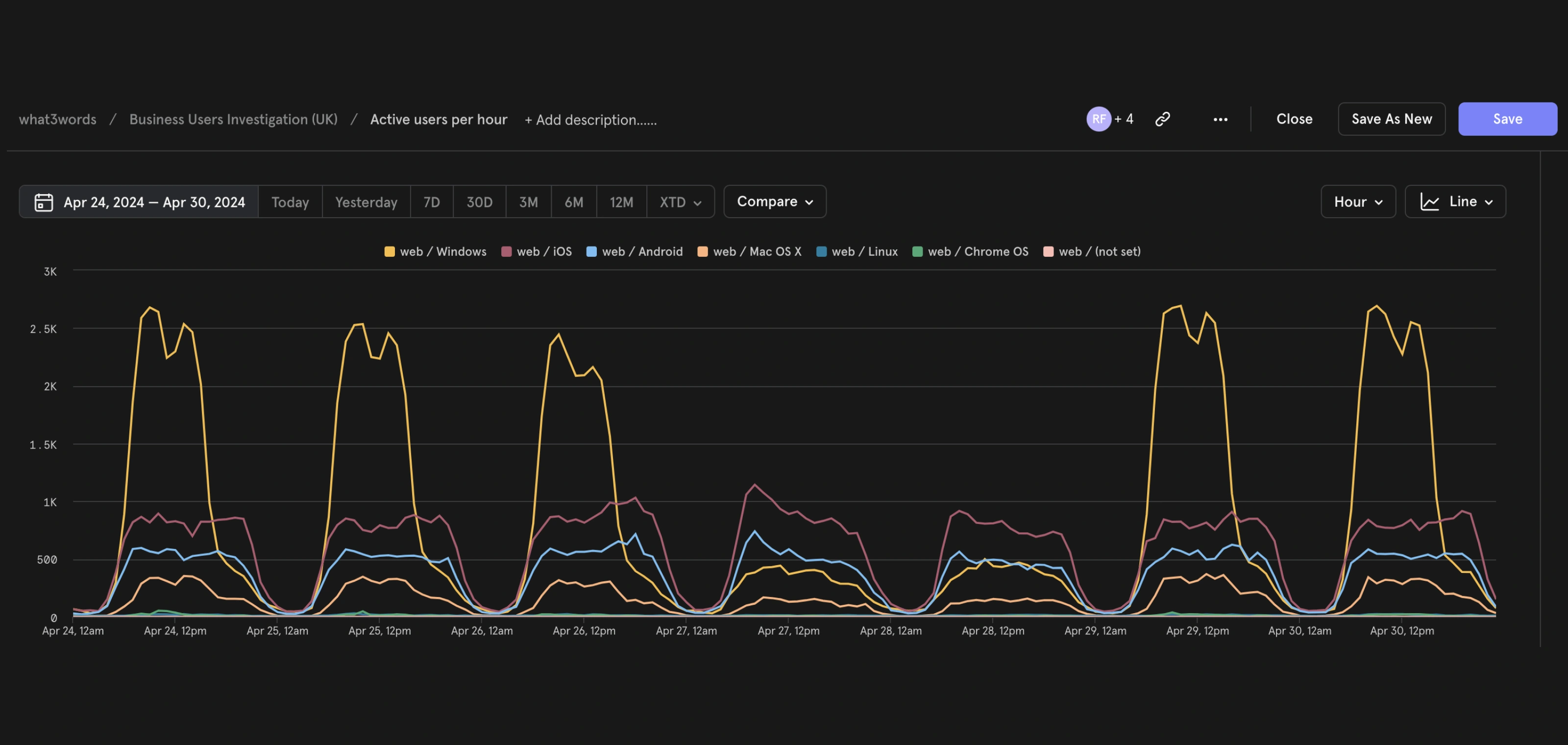
Mixpanel data highlighting unexpectedly high weekday web activity
These insights led us to explore a premium subscription that could create value beyond the core what3words experience, while keeping the app free and accessible to everyone, particularly for emergency services and non-profits. This gave us a clear way to introduce premium features while supporting our business goal of sustainable monetisation.

Paywalls — New Pro features are gated with locks, triggering the upgrade experience when users try to access them
Introducing Pro
With the core experience remaining free, my first challenge was determining how Pro should fit into the existing product. I explored three approaches, each representing a different level of separation between free and premium functionality.
Soft
Subtle until free limits are reached, with usage meters and upgrade prompts appearing only when needed.
Medium
More visibly integrated, using enhanced cues to distinguish premium features, with a 7-day free trial.
Hard
Clearly distinguished through strong upgrade prompts, distinct Pro styling, and premium features requiring payment.
Ultimately, we chose the Hard approach to make the distinction between what was already available and what Pro introduced immediately clear. A distinct AI and Pro visual language helped remove ambiguity around access and limits.

In-app navigation — Bringing the end-to-end navigation experience to Android, from journey planning to arrival
In-app navigation
My second challenge was working on Pro features to add value to our subscription. Until this point, users had to leave what3words to navigate to a location. We wanted to extend what3words beyond finding locations and into navigation. The Google Navigation SDK made this possible, reducing the need to switch between apps, creating a more useful and connected experience while increasing engagement.
The SDK also gave us the flexibility to customise the experience around what3words, while maintaining the familiar navigation patterns from Google Maps.
I explored how we could build a navigation experience that felt distinctly like what3words, while adding safety features such as saving your exact parking location and generating a what3words address for it.
Voice Assistant
As part of Pro, we explored how AI voice interactions could make working with locations more natural. The experience combined real-time audio streaming, transcription, location detection and AI responses, creating a new set of interaction states beyond a traditional touch interface.

AI Chat — Designing conversation states and patterns to make real-time AI interactions feel clear and responsive

My contribution focused primarily on the design system and interaction patterns supporting this experience. I helped define how the interface communicated states such as initialising, listening, processing, understanding and responding, creating a consistent visual language for an interaction that was constantly changing in real time.
The goal was to establish reusable patterns for AI interactions that could scale beyond the voice assistant and support the wider Pro experience.
AI Voice Assistant — Designing the interaction flow from real-time listening and processing to what3words address recognition and AI Chat results
Pro Web Experience
Creating a consistent Pro experience across platforms meant more than replicating mobile on web. I worked across the web product to identify where we could modernise the interface while reusing and extending patterns already established on mobile.
This allowed us to bring the web experience up to date much faster, without starting from scratch. I helped introduce AI Chat, Voice Assistant, File import, Multi-list saving, an updated action panel and notifications, creating a more consistent and capable Pro experience across mobile and web.
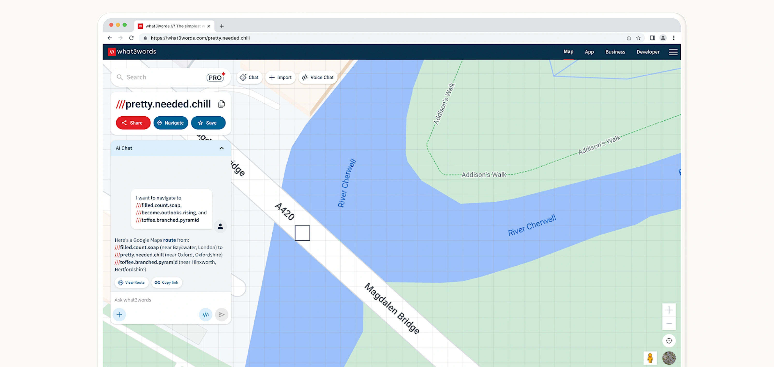
Introducing Pro features with updated mapsite design patterns, aligned with our mobile apps
Launching Pro
We launched what3words Pro as a significant expansion of the product, introducing a new subscription model alongside a range of new features. Within the first 30 days, 900 users signed up to Pro. With a free trial not yet available, this was an encouraging early signal of potential demand and helped us understand how many users were willing to pay for the new experience.
Challenges
The launch also came with challenges. Not all users were comfortable seeing familiar functionality move behind a paywall, so we closely monitored feedback and looked for opportunities to improve the experience. Given the scale and speed of the launch, we also had to make difficult trade-offs. Some features were deprioritised, including the Google Navigation SDK work I had led, after the initial integration costs per call proved too high. We chose to scale this back and focus on understanding the performance of Pro before making further investment.
Constraints
The scale of Pro meant our usual design process had to adapt. Rather than following a typical sequential process, Design, Product and Engineering worked closely together to explore, build and iterate at speed. This created an exciting level of collaboration and allowed us to deliver a large amount of new functionality in a short timeframe, but it also meant we couldn't always achieve the level of refinement and polish I would normally expect from a product launch.
What I'd do differently
If I were to revisit the project, I would invest more time in early user research and validation of the initial feature set. The pace of the launch made this difficult, and we had to make decisions with limited direct user input. However, we continued testing and gathering feedback after launch, using real-world behaviour and user responses to understand what was working and where we could improve.
The biggest learning for me was that launching a new product at this scale requires a different balance between speed, collaboration and craft. While we couldn't validate and refine everything to the level I'd normally aim for, the launch gave us valuable signals about user demand, willingness to pay and which areas were worth investing in next.
© 2026 Daniel Hermoso
